Case study · Customer churn
Analysis and retention planning on customers leaving an energy retailer
A European energy retailer lost one customer in ten every year. Management believed price rises were the cause and had a fix prepared: a 20% discount for anyone likely to leave. This analysis tests both ideas against 16,096 real customer records. The price theory is not supported by the data, and the discount is estimated to lose money in almost every configuration. Instead, churn follows the age of the customer relationship: the newest customers leave at roughly nine times the rate of the oldest.
Churn is the industry word for customers closing their accounts and leaving a business. Energy retailers watch this metric closely because winning a new customer costs far more than keeping an existing one, and in a competitive market customers can move to a rival with little effort.
The company here is PowerCo, a small-to-medium energy retailer in a competitive European market (the dataset is real, released for a well-known consulting case; sources are listed at the end). One note on scope: this data records who left but not why, because no exit reason was ever collected. The question of motive is taken up in a companion article, built on a different dataset that records why customers decided to leave a telecommunications company.
Sections 1 to 4 size the churn problem and test three hypotheses on why customers leave. Sections 5 and 6 map the customer base into segments and build a model to predict who will leave next. Section 7 evaluates whether the proposed discount pays for itself. Finally, sections 8 and 9 recommend four experiments and note the limits of this analysis.
Findings at a glance
Churn is high and skews to higher-value customers.
One customer in ten leaves each year, taking 11.4% of the yearly profit with them. The typical leaver is worth slightly more than the typical stayer, so the company is not simply losing its smallest accounts.
The price theory is not supported.
Customers whose prices fell during the year left slightly more often than customers whose prices rose. The likely explanation is that discounts had already been given to at-risk accounts, and those accounts left anyway.
Churn follows the age of the customer relationship.
The newest customers leave at 15.2% a year, the oldest at under 2%. Customers also do not wait for their contract to end: churn barely moves with the time left on a contract.
A prediction model concentrates the risk.
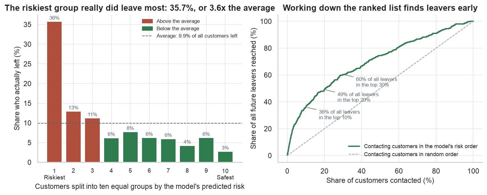
Graded on customers it had never seen, the best model's riskiest tenth left at 35.8%, against 9.9% for picking at random. It leans on profit margin, tenure and sales channel; the price signals do not make its top eight.
The planned 20% discount is expected to lose money.
Offered to everyone, the discount is estimated to lose roughly €506k a year. Targeted at the riskiest tenth using a prediction model, it still loses roughly €22k. Only a small 310-account version is estimated to make money, at roughly €12k a year.
How big is the churn problem?
Before testing any theory, the problem should be sized in the two units that matter: customers and money.
In the year the data covers, 1,595 of 16,096 customers left, a churn rate of 9.9% or roughly one in ten. However, counting customers is only half the picture. Customers differ significantly in what they are worth, so throughout this analysis I also track net margin (the profit a customer generates in a year after costs). Any retention budget has to pay for itself against this lost profit.
The two charts below size the problem both ways. The left chart counts customers; the right chart adds up profit.
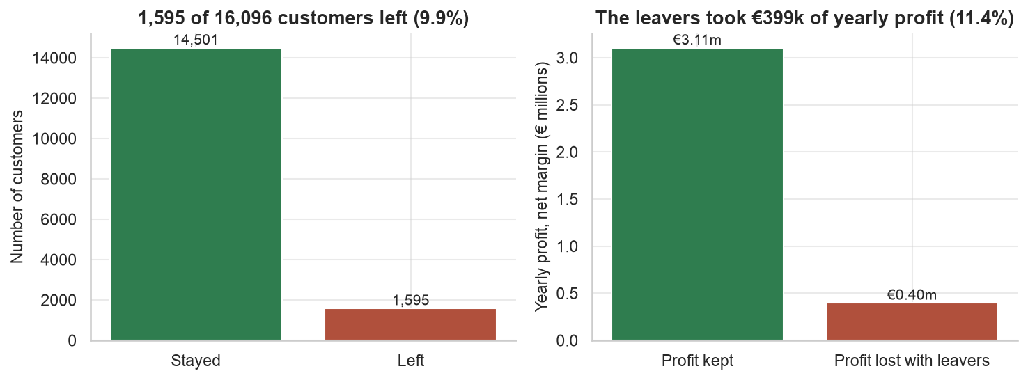
The leavers took €399k of the €3.51m yearly profit pool with them. That is 11.4% of the profit from 9.9% of the customers, meaning the typical leaver is worth slightly more than the typical stayer. Thus, the company is not simply losing its smallest accounts.
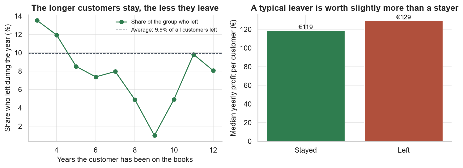
Two more observations came out of the first pass over the data. First, churn is nearly flat across customer size, so large accounts leave about as often as small ones. Second, churn falls steeply with the number of years a customer has been with the company. This second observation becomes the central thread of the analysis and is tested properly in hypothesis 2.
Hypothesis 1: Did price rises push customers out?
This was the client’s theory, and it is the reason the work was commissioned.
The theory is intuitive: energy is a commodity, prices went up, and customers left. It is also testable, because the data includes every customer’s monthly prices for the whole year. If rising prices drive churn, the customers with the largest price increases should have left at the highest rates.
To verify this, I measured how each customer’s price changed across 2015, sorted all customers by that change, and divided them into ten equal groups: group 1 received the deepest price cuts and group 10 the steepest rises. The chart below shows the share of each group that left. If the theory were correct, the bars would climb from left to right.
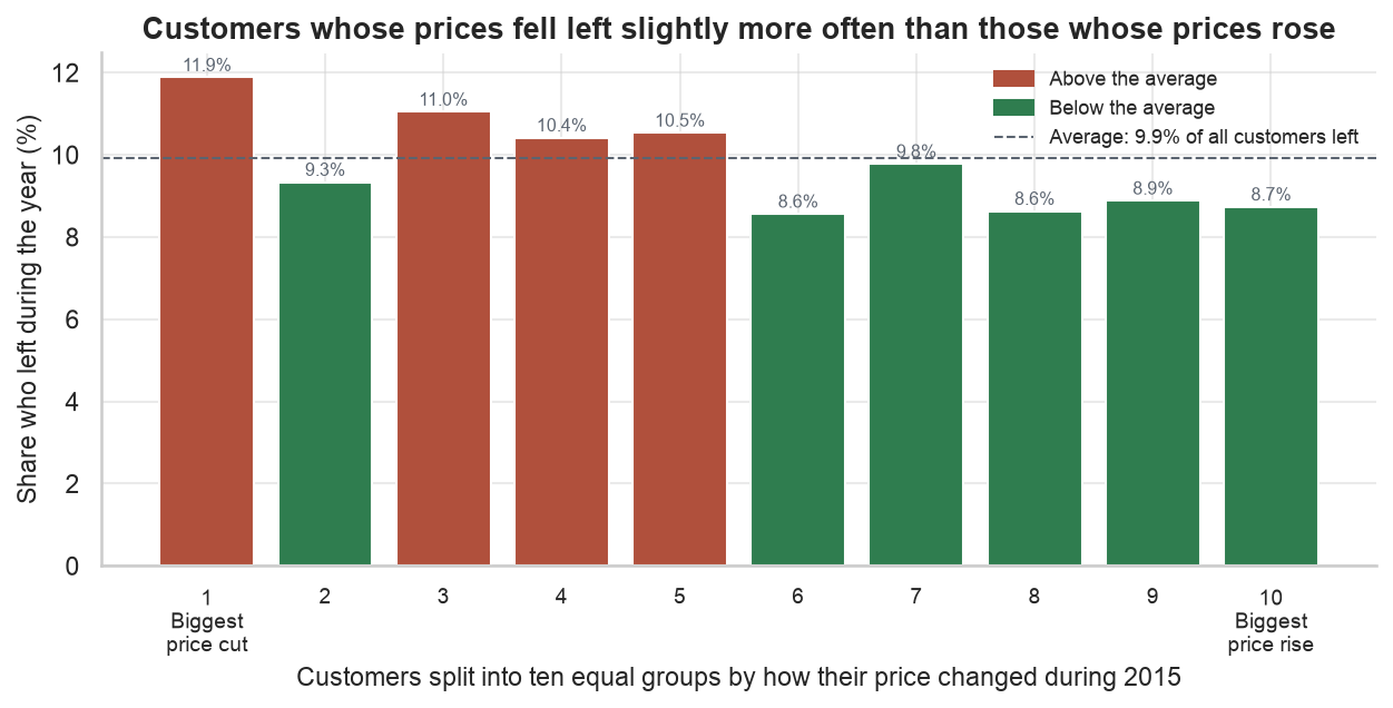
The bars show the opposite. The statistical link between price change and leaving is 0.003, on a scale where 0 means no link at all. In fact, the group whose prices fell the most left at 11.9%, compared to 8.7% for the group with the largest rises.
Still, I do not believe price cuts cause churn. A more likely explanation is that the retention team had already been giving discounts to accounts it was worried about, and those accounts left anyway. In other words, the price data records the company’s own past rescue attempts, not the cause of the leaving. This matters for two reasons: (1) a naive prediction model would learn this pattern backwards, and (2) it is the first hint that discounts were not addressing whatever was actually driving customers out. The exit interviews in the companion article explain this further.
Hypothesis 2: Is it about how long customers have been with the company?
The pattern from section 1 is tested properly here with a cohort view.
Section 1 showed churn falling with years on the books. A cleaner way to verify this is a cohort view: group customers by the year they joined, then compare the groups. Cohorts are useful because they separate when a customer joined from everything else that changes over time.
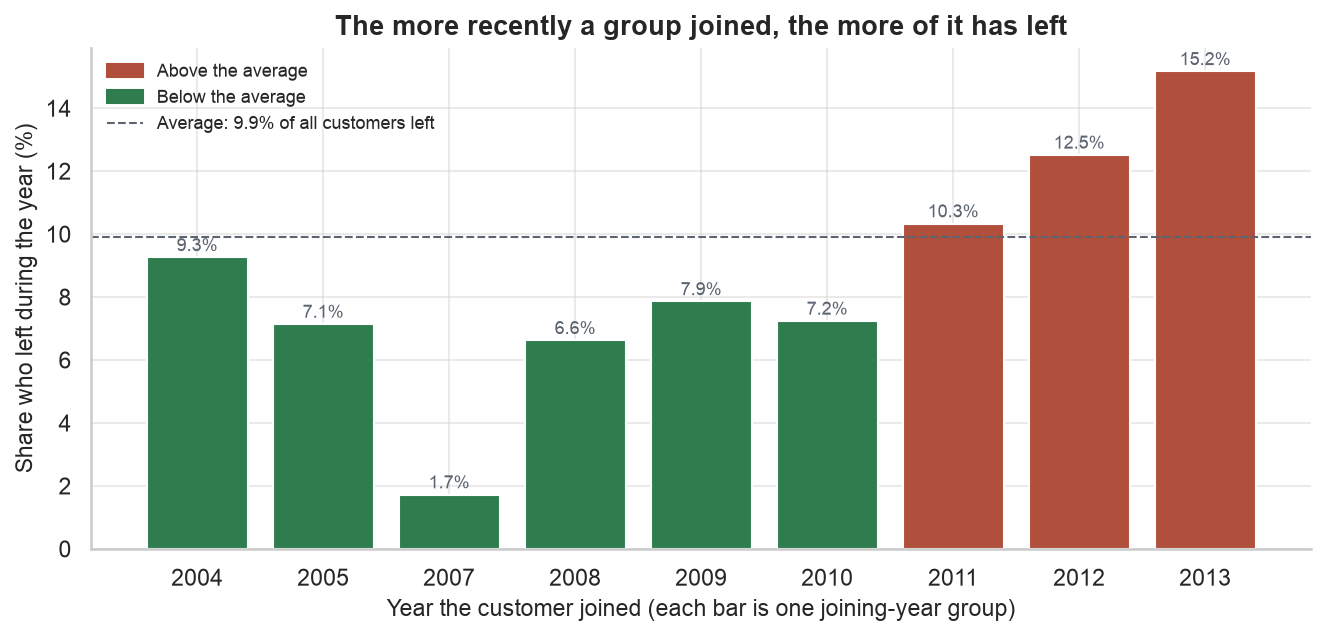
The pattern is clear. Customers who joined in 2013 left at 15.2%. The 2011 intake left at 10.3%, the 2010 intake at 7.2%, and the small 2007 group at 1.7%. As a rough rule, every additional year a group has been on the books halves its churn rate.
It should also be noted that this pattern is a projection. Each new intake starts at the highest churn rate, so if nothing changes about the first years of the relationship, the customer base keeps refilling with its riskiest customers and overall churn stays near 10% regardless of how loyal the older base is. Thus, growth alone will not fix the churn problem.
Hypothesis 3: Do customers wait for their contract to end?
I expected this hypothesis to hold; it is included because it did not.
Energy contracts run for fixed terms, so I expected leaving to concentrate where leaving is easy: near the end of a contract. If true, this would be operationally valuable, since the renewal calendar would tell the retention team exactly who to call and when. The chart below groups customers by how much time their contract had left, and shows the share of each group that churned.
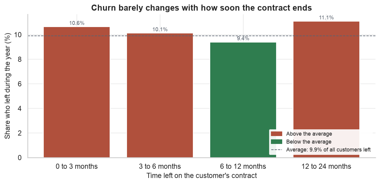
The spread across the groups is small, roughly 9.4% to 11.1%. Customers with two years left on their contract leave about as often as customers whose contract ends next quarter. In other words, customers do not wait for a convenient exit window; when they decide to leave, they leave, early-termination clauses included.
Which customers can the company least afford to lose?
Not every leaver costs the same, so the customer base needs a map before any retention money is spent.
A retention budget spread evenly across 16,096 businesses would mostly be wasted, because the accounts range from very small businesses to industrial sites. To create a usable map, I used a standard grouping method (K-Means clustering) to sort customers into four groups based on how much energy they use, the size of their connection, the profit they generate, and how long they have been customers. The method finds accounts that resemble each other without being told what to look for. Whether a customer later left was deliberately kept out of the grouping, so the map can be used on day one, before anyone leaves.
| Segment | Customers | Share of profit | Churn |
|---|---|---|---|
| Large commercial | 23% | 35% | 9.6% |
| Industrial premium | 7% | 29% | 10.8% |
| Recent switchers | 36% | 18% | 11.8% |
| Small steady | 34% | 18% | 7.9% |
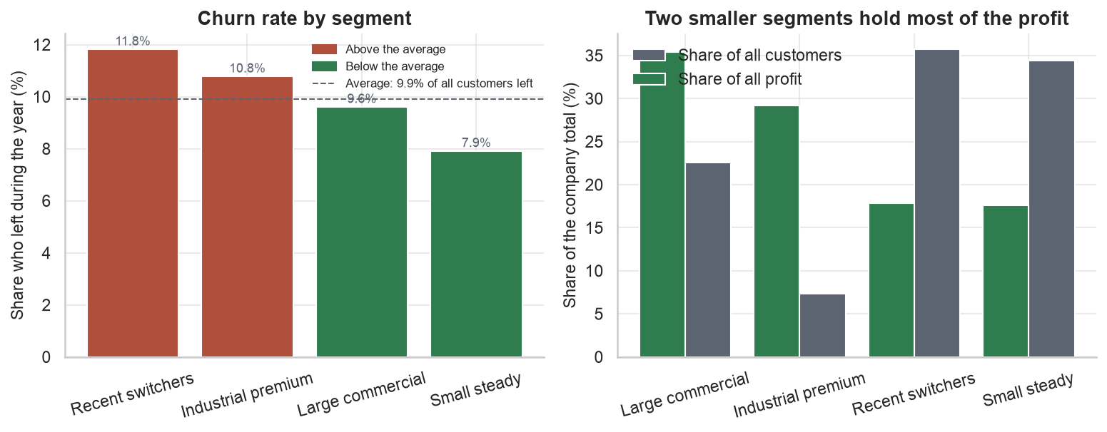
The two big-business segments hold 30% of the customers but 65% of the profit. The most expensive attrition per account is in Industrial premium, where 1,178 accounts with a median profit of €715 each are leaving at 10.8% a year. The segment with the highest churn is Recent switchers at 11.8%, which is consistent with hypothesis 2: newer relationships churn more.
Can we predict which customers will leave?
This section turns the patterns above into an early-warning score for every customer.
Everything so far describes groups. However, to act, the retention team needs a ranked list of the individual customers most likely to leave next. That is what a prediction model produces. It reads each customer’s attributes (tenure, size, profit, sales channel, prices and so on) and turns them into a single number: the predicted chance that this customer leaves.
To keep the evaluation fair, I trained three standard models on three quarters of the customers and graded them on the remaining quarter they had never seen. This held-out grading matters because any model can memorise the past; the only test that counts is ranking customers it has no answers for. Briefly, logistic regression draws the straightest possible line through the data and serves as the simple baseline, while random forest and gradient boosting are families of decision trees that can capture bends, such as the sharp drop in risk after the first few years.
The fairest plain-language comparison is to let each model flag the 10% of unseen customers it considers riskiest, and then count how many of those customers actually left.
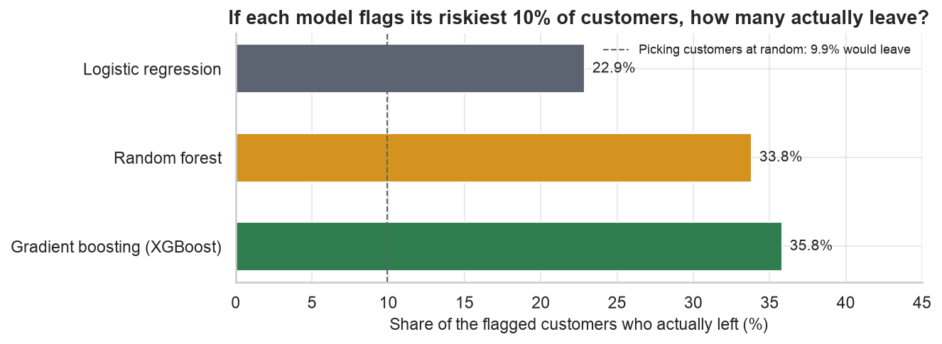
The best model’s riskiest picks left at 35.8%, roughly 3.6 times the random-picking rate. It should be noted that the two tree-based models clearly beat the straight-line baseline, which indicates that this churn problem contains genuine non-linear patterns, most notably the drop in risk with tenure. The next chart shows what the winning model’s full ranking looks like in practice.
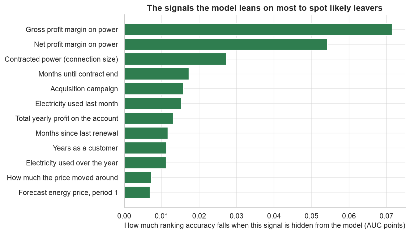
What is the model paying attention to? The chart below answers this directly, by hiding one signal at a time and measuring how much the ranking degrades. The answer is consistent with the hypothesis tests: profit margin, tenure, connection size and sales channel dominate. The price-change signals I engineered for hypothesis 1 do not appear in the top eight. The model was free to support the client’s theory, and it did not.
Would the 20% discount pay for itself?
The model can find likely leavers. Whether a discount is the right thing to send them is a separate question.
A retention discount has one benefit and one cost. The benefit is that a would-be leaver stays and keeps paying, now at 80% of their old profit. The cost is that most customers who receive the offer were staying anyway, and now they pay 20% less for nothing. Whether a campaign makes money depends on the balance between the two, and it hinges on a number nobody knows before running one: the save rate, the share of would-be leavers the offer actually convinces to stay. Retention programs typically achieve somewhere between 20% and 40%, so I simulated the whole range on the held-out customers, using their real outcomes.
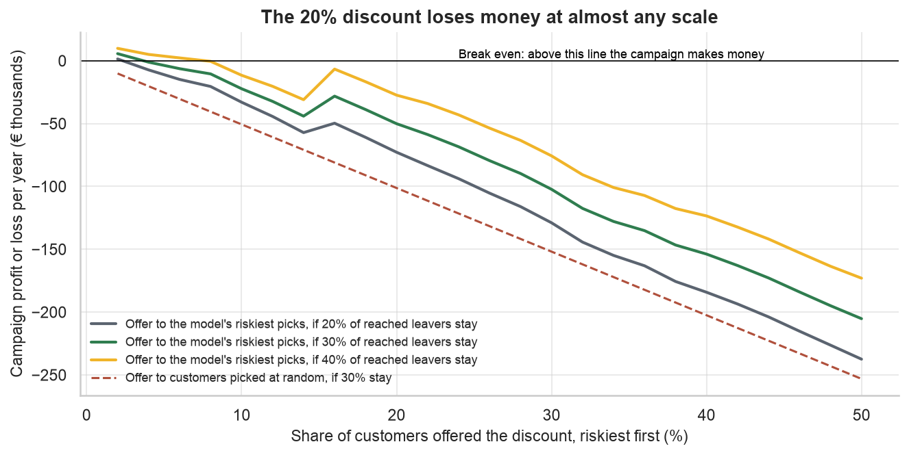
The lines rarely rise above zero. Offered to the whole customer base, the discount loses an estimated €506k a year. Offered only to the model’s riskiest tenth, it still loses roughly €22k, because even at that depth roughly 64% of the discounts go to customers who were never leaving, and the profit given away outweighs the profit saved on the leavers who are caught. For the riskiest-tenth version just to break even, the offer would need to save 51% of would-be leavers, roughly double what retention programs usually achieve.
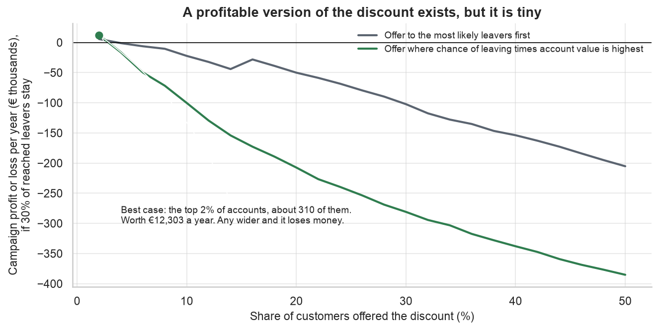
Still, one version does work. If customers are ranked by risk multiplied by account value instead of risk alone, and the 97 accounts that already lose money are excluded (there is no reason to retain unprofitable accounts with a discount), then a campaign restricted to the top 2% of the list, roughly 310 accounts, is estimated to make money.
The arithmetic is one reason to doubt the discount. The other is that this dataset records who left but not why, so a retention plan built on it alone is guessing at motive. The companion article takes up that question on a telecom dataset in which every one of the 1,869 leavers has a recorded reason. Telecom is not energy, so I treat its findings as supporting evidence rather than proof about energy customers. Still, the result is consistent with the simulation above: when leavers are asked directly, price ranks fourth, behind competitors, service quality and how customers were treated, and a discount answers only one of those.
What should the business do next?
Four experiments follow, in the order I would run them.
Almost nothing above proves cause and effect on its own. Observational data can say that the newest customers leave most, but it cannot say that a better first year would have kept them. One approach to bridge that gap is to perform A/B testing. In an A/B test, a group of customers is split at random, one thing is changed for half of the group, and the other half is left alone; churn is then compared a few months later. The random split is what makes the comparison fair, because both halves contain the same mix of everything else. Each experiment below names its change, its audience and its measure.
Pilot the discount on 310 accounts, not 16,000
Rank accounts by risk multiplied by value, exclude the loss-making accounts, and offer the discount to a random half of the top 310. The other half is the control group. The pilot is worth roughly €12k a year at best; its real value is a measured save rate, the number every other retention decision depends on.
Improve the first year of the relationship
New customers leave at roughly nine times the rate of the settled base, and every new intake starts at the top of that curve. Give a random half of new customers a check-in before their first bill and a fast resolution on their first problem, then compare churn at twelve months.
Audit the largest sales channel
The largest sales channel signs up almost half the customer base, and its customers leave at 12.5% against 5.6% for the best channel. This suggests some churn is being acquired at sign-up. Tighten sign-up quality rules on that channel for a quarter and compare the new intake against the previous one.
Offer the second fuel
Customers who buy both electricity and gas leave at 7.9%, against 10.4% for electricity-only customers. Send a bundle offer to a random half of single-fuel customers and measure both take-up and churn. A second product is retention that also generates revenue.
What this analysis cannot tell us
These caveats apply to every number above.
First, the energy data is a single snapshot with one window of outcomes, so it says who is likely to leave rather than when. Second, the discount arithmetic assumes a save rate until the pilot measures one, and the €12k best case rests on roughly 80 held-out customers, so it should be treated as pilot-sizing guidance rather than a forecast. Third, the data records nothing about motive, which is why the question of motive is handled in the companion article, on a dataset that was collected to answer it. Finally, none of the patterns here are causal until the experiments run. The price-cut finding is exactly what a selection effect looks like, and it is why every recommendation above is phrased as a test rather than a rollout.